
 BESPOKE & BUYING / THE DISPATCH
Personalization begins with editing
A person rarely arrives with one neat idea. They bring a dog, a birthplace, initials, a profession, a number, a song, a family symbol, a favorite color and the memory of who first taught them to wear a hat. None of those references is trivial. The work is deciding which one can stand for the rest.
That is where personalization becomes editorial. A custom hat does not become more personal simply because more biography is made visible. Often the opposite is true: one mark carries weight because it has room around it. The maker’s responsibility is not to print a life in full. It is to find the detail that lets the life be felt.
Build a hierarchy before adding detail
We begin with three levels: one primary symbol, one secondary accent and a quieter material language underneath them. The primary symbol should be the thing a viewer remembers. The secondary accent can answer it through stitching, color or a small repeated shape. Felt, edge treatment, band and hardware then support the story without asking for equal attention.
Distance matters, too. Some references belong across a room. Others should only reveal themselves when the hat is held, tipped or taken off. An underbrim burn, an interior engraving or a line of hand stitching can keep a private meaning close while the silhouette remains calm.
Before committing, we use simple tests. Does the hat still read clearly in silhouette? Is the focal point legible from the distance at which people will actually see it? If one element is removed, does the story become weaker—or merely quieter? The answer tells us whether that detail is carrying meaning or collecting space.
Symbols need translation, not copying
Engraving and burn work can look automatic from the outside. The laser may execute the line, but it cannot decide what the line should be. A crest, handwriting sample or small emblem has to be translated for the scale, nap and color of felt. Fine interior detail can disappear; heavy linework can become a dark patch; an oversized mark can fight the crown that is meant to hold it.
The design work happens before the tool moves. We simplify where the felt will not hold clarity, protect the proportions that make the source recognizable and position the symbol where the curve of the crown helps rather than distorts it. Technology gives the mark consistency. Judgment gives it a place in the hat.
From the Dungeon: Finer
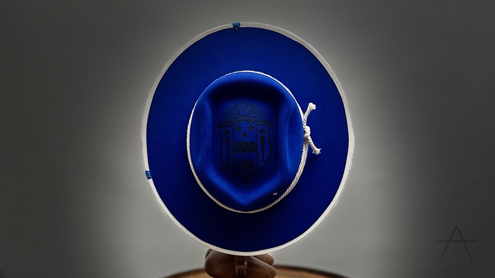
A recent House build called Finer makes that hierarchy visible. It begins with a royal-blue 220-gram rabbit felt, shaped to 58 centimeters with a four-inch sorority-badge crown and a flat, fully bound 3.25-inch brim. Those choices establish the architecture before the personal language arrives.
Inside the crown, a laser-engraved Zeta Phi Beta shield becomes the primary symbol. It is substantial, but it does not cover the object. White rope and the white bound edge frame the blue felt without competing with the shield; decorative stitching and the House’s black needle finish the composition at a smaller scale.
Finer carries identity clearly because every element has a job. The shield speaks first. The rope, binding and stitchwork keep the rhythm. The shape still holds when the details are viewed from farther away. Restraint here is not absence. It is what allows the chosen symbol to remain specific.
Under the Brim: the one-mark test
When a personalization brief begins to crowd, ask one question: if someone remembered only one element of this hat, which element should it be? If the answer is unclear, the design is not finished.
Choose that primary mark first. Then decide whether each remaining idea should support it, move somewhere more intimate or leave the hat entirely. A number may become two stitches. A color may live only at the brim binding. Initials may sit under the brim instead of on the crown. Editing does not erase the story; it changes the volume at which each part is told.
A biography in one mark
The most personal hats do not explain themselves all at once. They offer a clear first reading, then reward closeness. Shape introduces the wearer. Material sets the tone. One symbol opens the deeper story.
A biography need not be printed in full to be understood. Sometimes one mark—placed with proportion, translated for the material and given enough quiet around it—is enough.
Continue the process
Custom Hat vs. Hat Bar: What Are You Actually Buying?
Hat Crown Styles: A Guide to Teardrop, Cattleman, Telescope and More
Continue the story.